Function drives our work. Well-designed architecture not only integrates but serves and elevates the program, rendering it accessible and exciting.
The primary defining walls of the Kimbell Art Museum Expansion are exquisite cast architectural concrete of a mottled light gray tone, with some marble-like veining and a wonderful matte sheen. Just as creative bursts and punctilious care birthed the masterpieces on display, so, too, keen invention and exhaustive efforts ensured the ordinarily humble material would be a suitable backdrop, helping glorify the likes of Caravaggio, Michelangelo, or in this case a series by François Boucher.
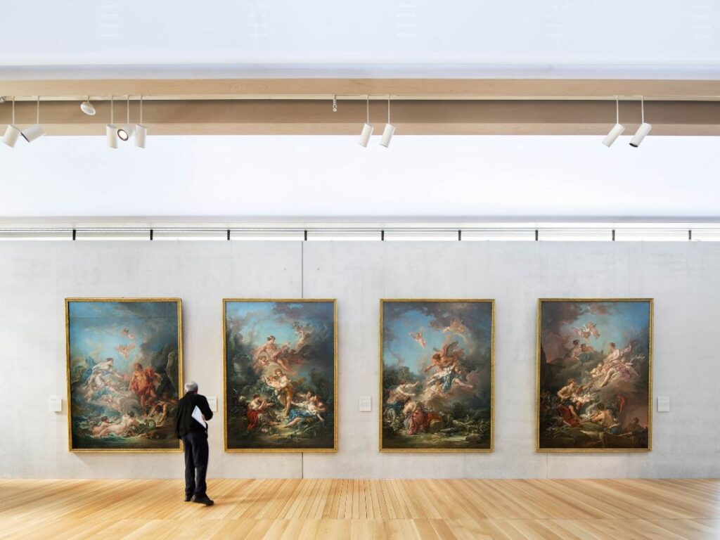
While serving as a complimentary backdrop, the concrete does present some art installation challenges. As exhibits come and go, we wanted to protect the precious walls from damage and residual patterns inevitable were fasteners used to secured artwork directly to the wall. We also wanted to maintain a clean, monolithic wall up to the light slot above.
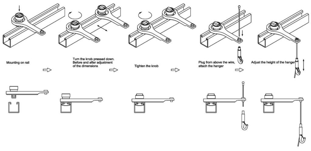
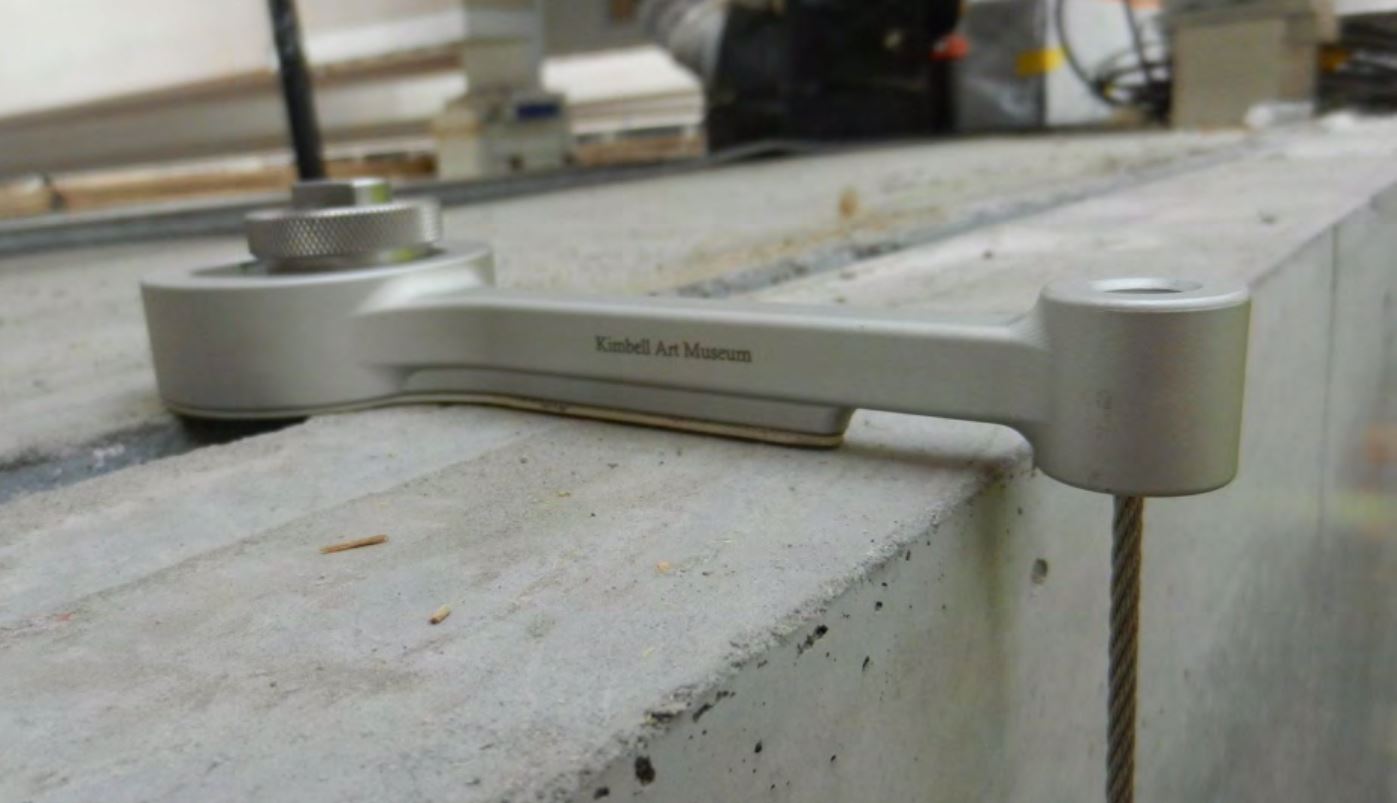
Our solution was to cast in a standard Unistrut anchor channel into the top face of the wall, and invent a hanger arm that could readily snap in and suspend a thin cable with a hook to pick up the paintings below. The elegant custom hanger is made of cast stainless steel with a shotblast finish, ergonomically and structurally shaped to exactly its purpose.
Developed in generous collaboration with Japanese manufacturer Takiya and the Kimbell’s Operations Manager Larry Eubank, it is called the LD Hook after Larry and Daniel (Hammerman).
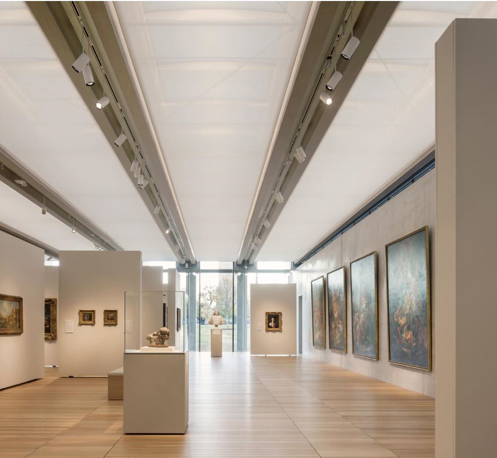
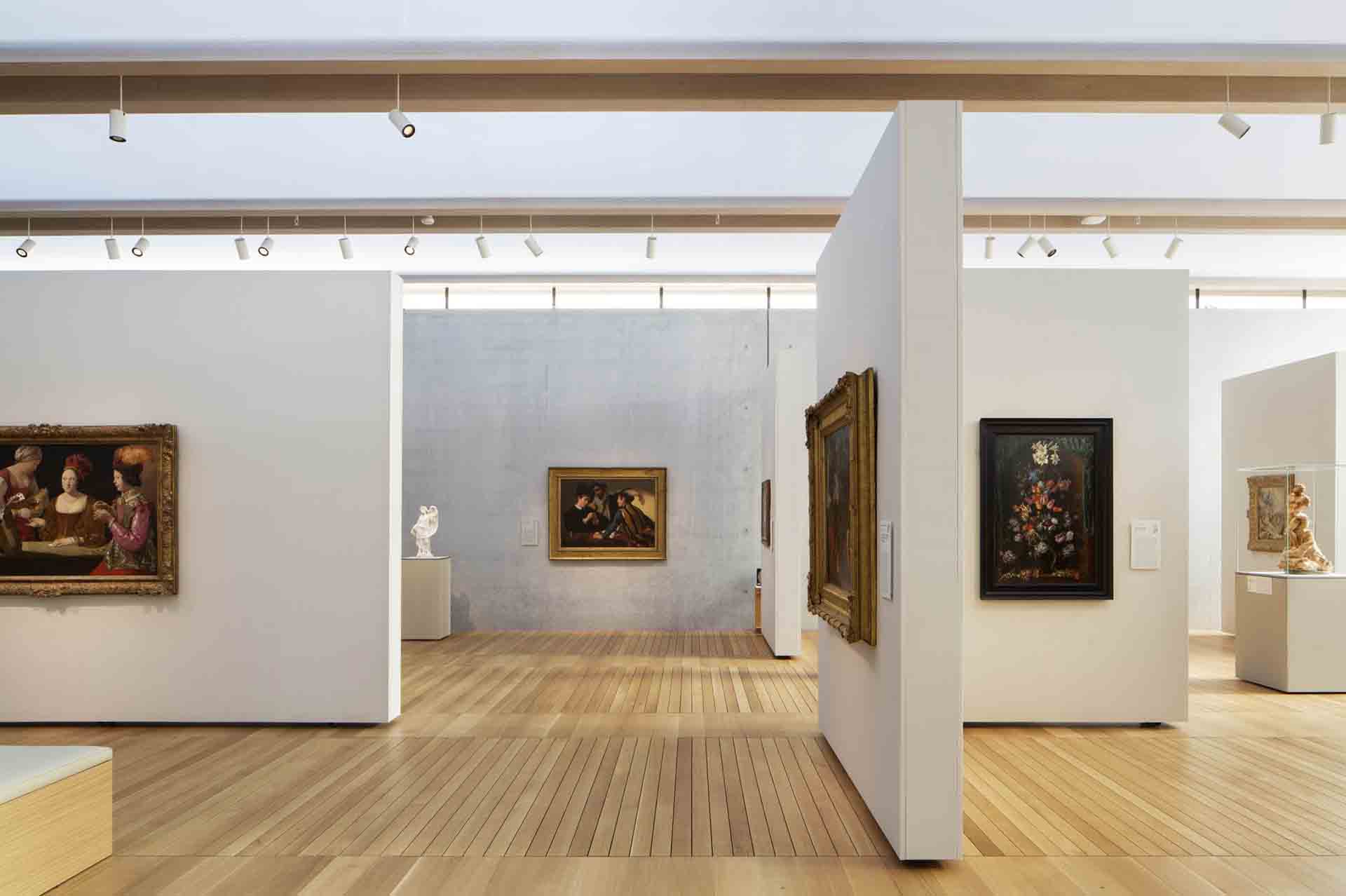
Not all the Kimbell’s paintings float in front of the perimeter concrete walls. We also developed a modular partition system, in collaboration with the Kimbell and the engineer/fabricator Goppion.
The Kimbell was keen on pre-fabricated temporary walls, to minimize the carpentry effort, expense, and mess every time an exhibit changes. We were also keen to keep the walls tall in proportion to the artwork and the gallery scale, and yet slender, while avoiding reliance on girth and ballast for stability.
The first challenge was working with the curators to develop a set of partition module sizes that would give them a comfortable amount of flexibility, while affording some standardization conducive to pre-fabrication. We worked through many real and theoretical exhibit layout possibilities using a scale model, and boiled down to three lengths and two heights.
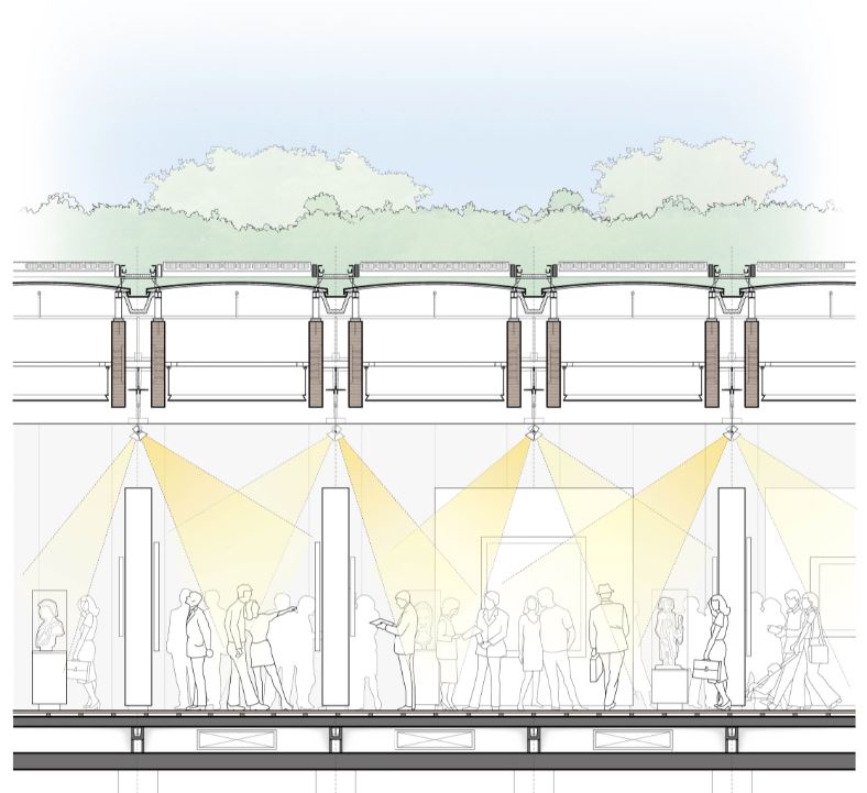
We also hoped to maintain a harmonious relationship between the partitions and the building module. Echoing the Kahn Building across the lawn, the Piano Pavilion has a rigorous modularity and longitudinal orientation. Alignments follow from roof glazing rafters, to timber beam connections, to wood floor joints, and everything in between.
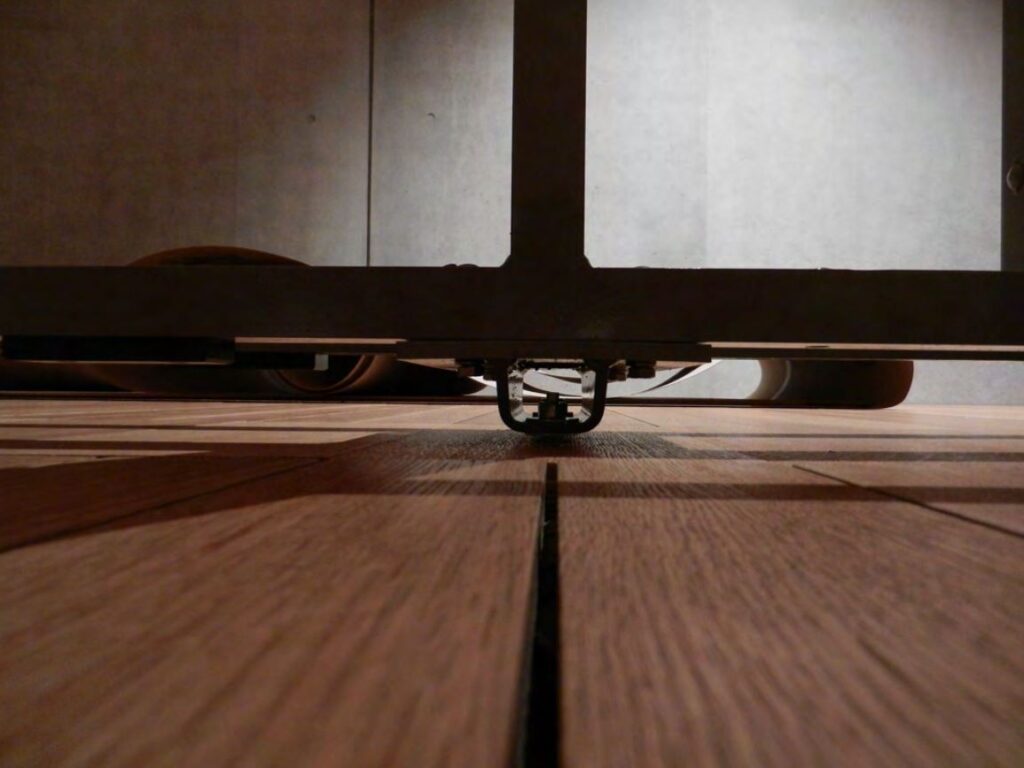
Further, we wanted the partitions to feel light and temporary in contrast to the concrete, floating above the floor with light passing underneath, and able to stand independently with gaps at intersections allowing for more porous light and views.
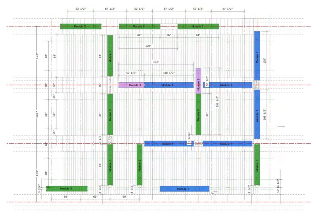
While meeting these desires, of course the system had to be extremely rigid to properly support precious artwork, without any give in case of accidental (or malicious) impact from visitors, to meet the naturally stringent expectations of conservators, curators, and insurers.
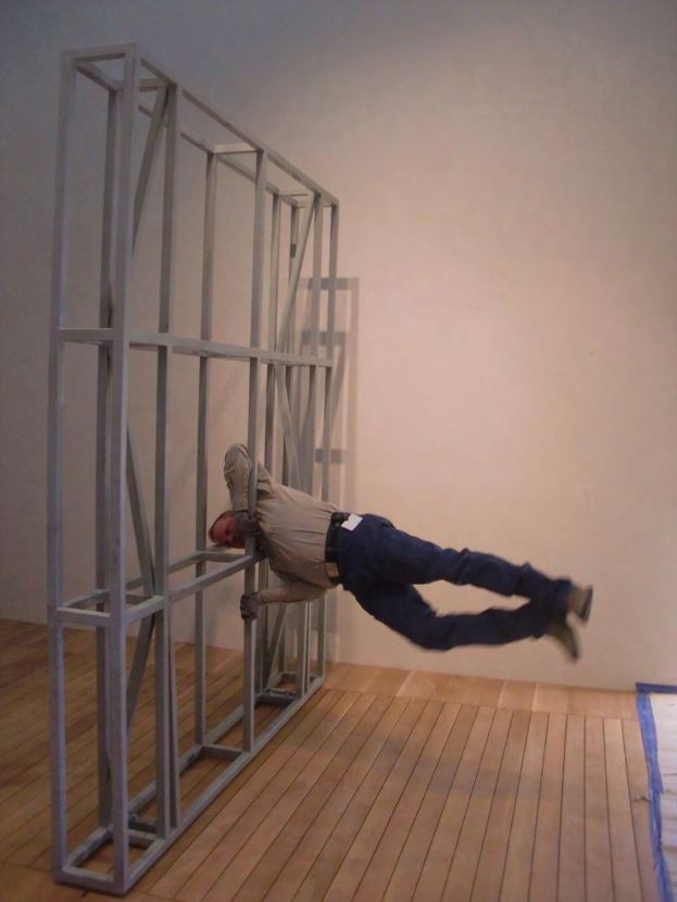
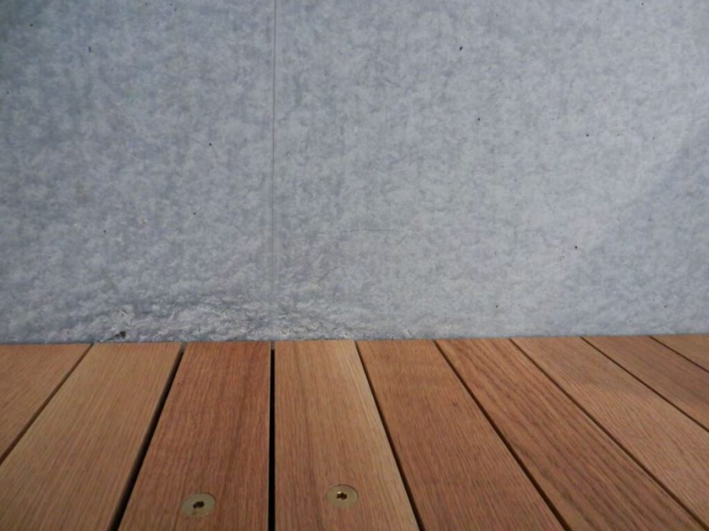
Combining together all these demands, we came up with a rigid welded aluminum square tube braced frame (stiffer than wood, but lighter and more transportable than steel), elevated on two steel feet, each secured to the floor at prescribed modular locations in the floor made visible by brass flush bolt pairs when not in use.
Bolt locations correspond with the building grid and the partition module sizes, allowing for wide flexibility while maintaining relationship to the architecture. The base connections actually go through the floor (which is a “breathing” deck for displacement ventilation from a plenum below without floor grilles) down to the concrete structural slab below.
Formal engineering and informal load testing confirmed the frame rigidity. At only 10 ½” thick, the walls can support up to 1200 lbs. Plywood panels on Z-clips sheath the metal frames, and in turn are wrapped in fabric like at the Kahn building for a finished appearance.

Function drives our work. Well-designed architecture not only integrates but serves and elevates the program, rendering it accessible and exciting.
The primary defining walls of the Kimbell Art Museum Expansion are exquisite cast architectural concrete of a mottled light gray tone, with some marble-like veining and

a wonderful matte sheen. Just as creative bursts and punctilious care birthed the masterpieces on display, so, too, keen invention and exhaustive efforts ensured the ordinarily humble material would be a suitable backdrop, helping glorify the likes of Caravaggio, Michelangelo, or in this case a series by François Boucher.
While serving as a complimentary backdrop, the concrete does present some art installation challenges. As exhibits come and go, we wanted to protect the precious walls from damage and residual patterns inevitable were fasteners used to secured artwork directly to the wall. We also wanted to maintain a clean, monolithic wall up to the light slot above.

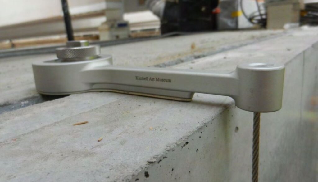
Our solution was to cast in a standard Unistrut anchor channel into the top face of the wall, and invented a hanger arm that could readily snap in and suspend a thin cable with a hook to pick up the paintings below. The elegant custom hanger is made of cast stainless steel with a shotblast finish, ergonomically and structurally shaped to exactly its purpose. Developed in generous collaboration with Japanese manufacturer Takiya and the Kimbell’s Operations Manager Larry Eubank, it is called the LD Hook after Larry and Daniel (Hammerman).
Not all the Kimbell’s paintings float in front of the perimeter concrete walls. We also developed a modular partition system, in collaboration with the Kimbell and engineer/fabricator Goppion.
The Kimbell was keen on pre-fabricated temporary walls, to minimize the carpentry effort, expense, and mess every time an exhibit changes. We were also keen to keep the walls tall in proportion to the artwork and the gallery scale, and yet slender, while avoiding reliance on girth and ballast for stability.

The first challenge was working with the curators to develop a set of partition module sizes that would give them a comfortable amount of flexibility, while affording some standardization conducive to pre-fabrication. We worked through many real and theoretical exhibit layout possibilities using a scale model, and boiled down to three lengths and two heights.
We also hoped to maintain a harmonious relationship between the partitions and the building module. Echoing the Kahn Building across the lawn, the Piano Pavilion has a rigorous modularity and longitudinal orientation. Alignments follow from roof glazing rafters, to timber beam connections, to wood floor joints, and everything in between.

Further, we wanted the partitions to feel light and temporary in contrast to the concrete, floating above the floor with light passing underneath, and able to stand independently with gaps at intersections allowing for more porous light and views.
While meeting these desires, of course the system had to be extremely rigid to properly support precious artwork, without any give in case of accidental (or malicious) impact from visitors, to meet the naturally stringent expectations of conservators, curators, and insurers.


Combining together all these demands, we came up with a rigid welded aluminum square tube braced frame (stiffer than wood, but lighter and more transportable than steel), elevated on two steel feet, each secured to the floor at prescribed modular locations in the floor made visible by brass flush bolt pairs when not in use.
The bolt locations correspond with the building grid and the partition module sizes, allowing for wide flexibility while maintaining relationship to the architecture. The base connections actually go through the floor (which is a “breathing” deck for displacement ventilation from a plenum below without floor grilles) down to the concrete structural slab below.
Formal engineering and informal load testing confirmed the frame rigidity. At only 10 ½” thick, the walls can support up to 1200 lbs. Plywood panels on Z-clips sheath the metal frames, and in turn are wrapped in fabric like at the Kahn building for a finished appearance.
